
Preferred Blog
Preferred has been serving the Tinley Park area since 1991, providing IT Support such as technical helpdesk support, computer support, and consulting to small and medium-sized businesses.
Making a Graph in Microsoft Excel is as Easy as Pie
When you need to make your point in a big way, you can make a sharp looking graph. You may think that graph making is difficult, but thanks to tools like Microsoft Excel, creating a convincing chart is as easy as pie! To help you out, we'll walk you through how to make a graph in Microsoft Excel.
To start, we'll need to populate data fields in Microsoft Excel with figures that will make up our graph. Let's pick a topic that every computer user will find interesting, like the worldwide breakdown of desktop operating systems accessing the Internet. We can find this information from a January report on Netmarketshare.com. We'll take their data and insert each figure into its own cell.
Now we will go to the Insert tab and turn these figures into a graph by selecting the desired graph listed under Charts. Since we're breaking down these figures from 100%, going with a pie chart is appropriate. Also, pie is delicious, so let's choose a pie chart.
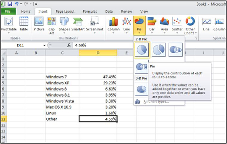
Like a dessert buffet, clicking on the Pie icon will give us a variety of pies to choose from. For the sake of getting a chart made so that we can check to make sure our data is accurate, we'll go ahead and select 2-D Pie. At the end of this tutorial, you can go back to the Insert tab and select all the different styles of charts in order to find the perfect look for your graph, but we'll hold off on that step for now.
Because we had a filled out data field selected before we clicked on 2-D Pie, we will see a pie chart appear in our Excel spreadsheet that automatically took our rows of information and turned them into a pie chart. If you see a blank space instead of a graph, then hit Undo, select a cell that contains your information (like D11 in our example), and then go back and select 2-D Pie.
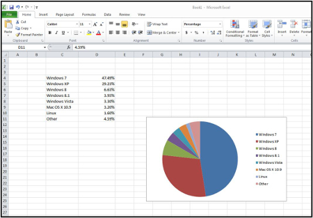
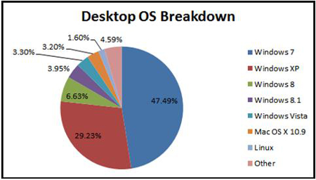
Our new graph is starting to take shape, but it's missing something, the percentages. To add these figures to our chart, we'll right click on the graph and then go to Add Data Labels.
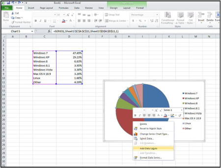
Our pie chart will now have the percentages on display, but it's still missing a crucial component, the title. To add a title, we will right click the graph and go to Select Data. This will bring us to the Select Data Source menu.
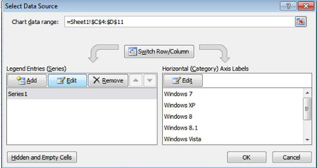
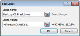
In the Select Data Source menu, we'll click on the Edit button. This will bring up the Edit Series menu; from here we can enter the name of our title in the Series name form. A fitting name that we'll give to this pie chart is "Desktop OS Breakdown." After we've entered our title in the form we will click OK.
Check out our completed graph! We've just made an easy-to-read pie chart with a title and colors that coordinate to the appropriate operating systems. This is one good-looking graph that you can print off, save as an image to share it online, or you can easily insert it into a slideshow. In fact, this same graph-making procedure also applies to other Microsoft Office applications like PowerPoint, Word, and more.
If you want to spice up your graph, you can click around and change the colors, font, chart style, and much more. This is your chance to make your graph stand out, just remember to not go overboard and have the cosmetic edits distract from the information that you want to present.
Now that you've made a great looking pie chart, you should celebrate with a slice of pie. What's your favorite pie? Let us know in the comments!
Sign Up for Our Newsletter
Latest Blog Entry
Text messages are great. They’re a quick and effective means for us all to communicate. Unfortunately, this does bring some downsides, too… namely, they’re a relatively simple means for a scammer to spread their attacks. Let’s discuss why this is so dangerous and how y...
Latest News
Best Places to Work - 5 YEARS STRONG!!
Preferred is once again, honored for being a Best Place to Work for the fifth straight year! Our team is what makes Preferred a Best Place to Work.
Daily Herald Suburban Business 2024 Best Places to Work Honorees The Daily Herald Suburban Business has announced the names of 51 companies, in 5 categories of competition, that are honored as the 2024 Best Places to Work in Illinois. This statewide survey and awards program was designed to identify, recognize and honor the best places of employment in Illinois, benefiting the state's economy, its workforce and businesses.


Comments